


The diagram shows that the
amount of Insolation received by the Earth’s surface does indeed vary.
At the Equator there is a year round gain of Insolation and this region
gains the most Insolation of all of the locations on the globe.
The amount of Insolation at the Equator also varies little throughout the
year. As you progress north and south of the Equator the amount of Insolation
received by the Earth’s surface varies seasonally and decreases in quantity
towards the Poles. The Northern
Hemisphere receives its maximum amount of Insolation between March and
September, and for the Southern Hemisphere it is between September and March.
There are times of the year when
The principle reason for
these patterns is the way in which the Earth travels around the sun each year.
This is shown in the images below.

The Earth is tilted at an angle of 23.5° relative to the sun and this has
a marked impact upon the amount of Insolation received by different places and
at different times of the year. On
December the 21st (My birthday!) the North Pole is tilted away from
the sun, and the maximum overhead sun is located at the Tropic of Capricorn.
Hence the North Pole receives no insolation at this time and the Tropic
of Capricorn its maximum amount. 3 months
later, the Earth has moved into a position where the maximum overhead sun is
over the Equator, which receives the most insolation.
The Northern and Southern hemispheres are in spring and autumn
respectively. On June the 21st,
the Earth has continued its journey so that the maximum overhead sun is over the
Tropic of Cancer (23.5° N), and the Northern Hemisphere experiences its maximum
amount of insolation received and summer. This accounts for the seasonality of
Insolation, but what about the total amount received by different latitudes?
The total amount of insolation received by the latitudes of the Earth does not
vary a great deal, but the curvature of the Earth has a vital role to play in
determining how much Insolation is received by different places.
The image below shows this.

As you can see above, because
of the curve of the Earth a sunbeam of Insolation hitting the Earth at higher
latitudes has to spread out over a larger surface area than one reaching the
Equator. Thus lowering the amount of
Insolation per km2 in more Northerly and Southerly latitudes.
In addition, because the insolation hits the atmosphere at a greater
angle in more northerly and southerly latitudes it has more atmosphere to pass
through (despite the lower atmosphere being thicker at the Equator than it is at
the Poles because of available heat energy).
The result of this is that at higher latitudes there is greater chance of
scattering and absorption which lowers the amount of radiation received.
The curvature of the Earth and its tilt also combine to affect the length of Day
and Night in higher latitudes. As shown on Figure 3, in December the maximum
overhead sun is over the Tropic of Capricorn and because of this and the Earth’s
curve day length shortens in Northern latitudes and goes to 0 hours at the North
Pole. This means that during this
period these areas receive very little Insolation during these short days.

There are other more local and short term factors that can affect the
amount of Insolation received by a location.
Altitude has a
significant impact upon the temperature of the air.
This is because the mountains higher up have significantly less surface
area with which to heat the air that surrounds it (recall that the air is
largely heated from the ground upwards).
In addition, because atmospheric air pressure falls with height, there
are greater gaps between the molecules in the air so their ability to hold and
transfer heat decreases too.
Aspect is another
factor that influences the heat budget at a local level; this is because
hillsides alter the angle at which the sun hits the ground.
In the Northern hemisphere it is seen as advantageous for homeowners to
have a garden that faces towards the south.
This is because the south facing slopes are orientated towards the sun
for the majority of the day and hence receive the most sunlight.
North facing slopes are often the ones where glacier creation starts, as
snow is protected from the sun’s rays.
North facing slopes are called Adret whilst south facing slopes are
called Ubac.
Cloud Cover –
this is a hugely important determinant on the local heat budget of a place and
is experience d by people in the
In conclusion, the amount of
insolation across the Earth’s surface varies greatly over both space (altitude
and latitude) and over different periods of time (a day, the seasons and a
year). However, I feel that it is
the way in which the Earth moves around the sun, the tilt of the Earth and the
length of day and night that have the greatest impact of Insolation levels.
Altitude, aspect, cloud cover and urbanisation can have local impacts,
but our insolation levels are generally under the influence of forces operating
at planetary scales.
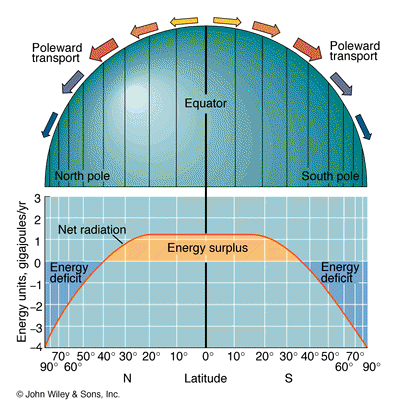
Using the image above answer the following questions;
1. Describe the balance of energy received at the Earth's surface?
2. How does this balance of energy
link the the Tri-cellular model of atmospheric circulation?
3. Think of as many reasons as possible to explain
a) Areas of energy surplus
b) Areas of energy Deficit
Click on the image to get very complicated notes on this issue.
Heat Budget
Below is a satellite image of the lower troposphere, the blue and purple colours represent areas of lower solar energy and the red areas higher energy. What pattern is evident on the map and why?

Click on the Image to go to its source page at NASA
For more activities and information try the NASA education site